Back in the day, if we wanted to add a cool scrolling text animation to a website. The best and the easiest option would be to use the marquee tag, but nowadays it is deprecated and not advised to use it.
but with the modern properties that CSS has, we could do the exact thing even without JavaScript help!
In this tutorial, we will learn how to make scrolling text animation using the CSS animation property and @keyframe rule. So little knowledge of them is required.
<div class="scrolling_text">
<div class="text">
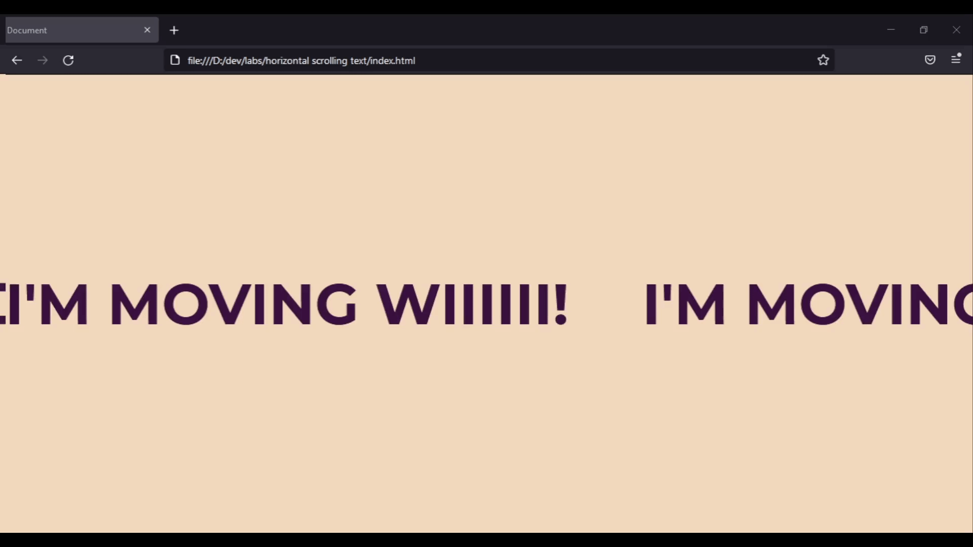
<span>I'm moving wiiiiii!</span>
<span>I'm moving wiiiiii!</span>
<span>I'm moving wiiiiii!</span>
<span>I'm moving wiiiiii!</span>
<span>I'm moving wiiiiii!</span>
</div>
<div class="text">
<span>I'm moving wiiiiii!</span>
<span>I'm moving wiiiiii!</span>
<span>I'm moving wiiiiii!</span>
<span>I'm moving wiiiiii!</span>
<span>I'm moving wiiiiii!</span>
</div>
</div>
Let’s break it down.
We created a parent element with the class name .scrolling_text that will be our main container.
Within it, we added two dives with class .text. Inside the .text element, we wrapped each word with the span tag to separate them.
You might ask yourself, why did we repeat .text twice?
We did this to make animation seamless because. If we used one .text element, there will be a blank space when its animation is about to complete as shown bellow.
we will start by styling the container element first.
.scrolling_text {
    width: 100%;
    overflow: hidden;
    display: flex;
    white-space: nowrap;
}
In the above styles, We set the width of the .scrolling_text to 100% to make it take the full width of the page.
We used white-space property and set it to nowrap to prevent the text line from breaking.
also, it is important to set overflow to hidden to prevent the horizontal scrolling bar from appearing.
Next, let’s add styles to the .text element.
.text {
    font-size: 80px;
    font-weight: 700;
    text-transform: uppercase;
    color: #3A1240;
}
As for the text element, nothing special is happening. We just made the font big and capitalized it to make it stand out.
Lastly, let’s add a margin on the left and right sides of the span element to separate the words.
.text span {
    margin: 0 40px;
}
And that is all basic styling. Now we are going to add the animation. The fun part!
To use CSS animation, we have to define the animation sequences with the @keyframes rule first. And then call it on the element we want to implement the animation on using the animation property.
So, let’s begin by defining our animation sequence using the @keyframes.
@keyframes animate_text {
    from {
      transform: translate3d(0, 0, 0);
    }
    to {
      transform: translate3d(-100%, 0, 0);
    }
}
We set the animation sequence to move the element from its initial position to the left side by using the transform property.
Note: Each @kayframes requires a name, so it can be used. In our case, we named our animation “animate_text”.
Now let’s apply the animation sequence we defined to the element we want to animate. Which is the .text element by adding the animation property to it.
.text {
    font-size: 80px;
    font-weight: 700;
    text-transform: uppercase;
    color: #3A1240;
    animation: animate_text 30s linear infinite; /* The animation property */
}
We called the animation sequence we defined with the @keyframes by using the name we gave it which is animate_text. And we set the animation duration to 30 seconds and looped it infinitely by adding the infinite keyword.
And voila! Our horizontal scrolling text.
We learned how to make a scrolling text animation, and how to implement animation using the @keyframes rule and animation property in CSS.
I hope this article was helpful to you, thanks for reading!